Crinkle and colour
puzzling out a novelty book
Novelty books are ones with pop-ups, or flaps, or different textures. They’re fun to read with little kids and fun to work on because there’s an extra puzzle piece to hold in your brain while making the artwork.
I worked on a Christmas novelty book this year. I knew there would be glitter, felt and so on in this book. And I knew which parts of the image they would be on.
But I can’t see those textured bits until after the book is finished and printed. So there’s a bit of guess work involved while I make the artwork.
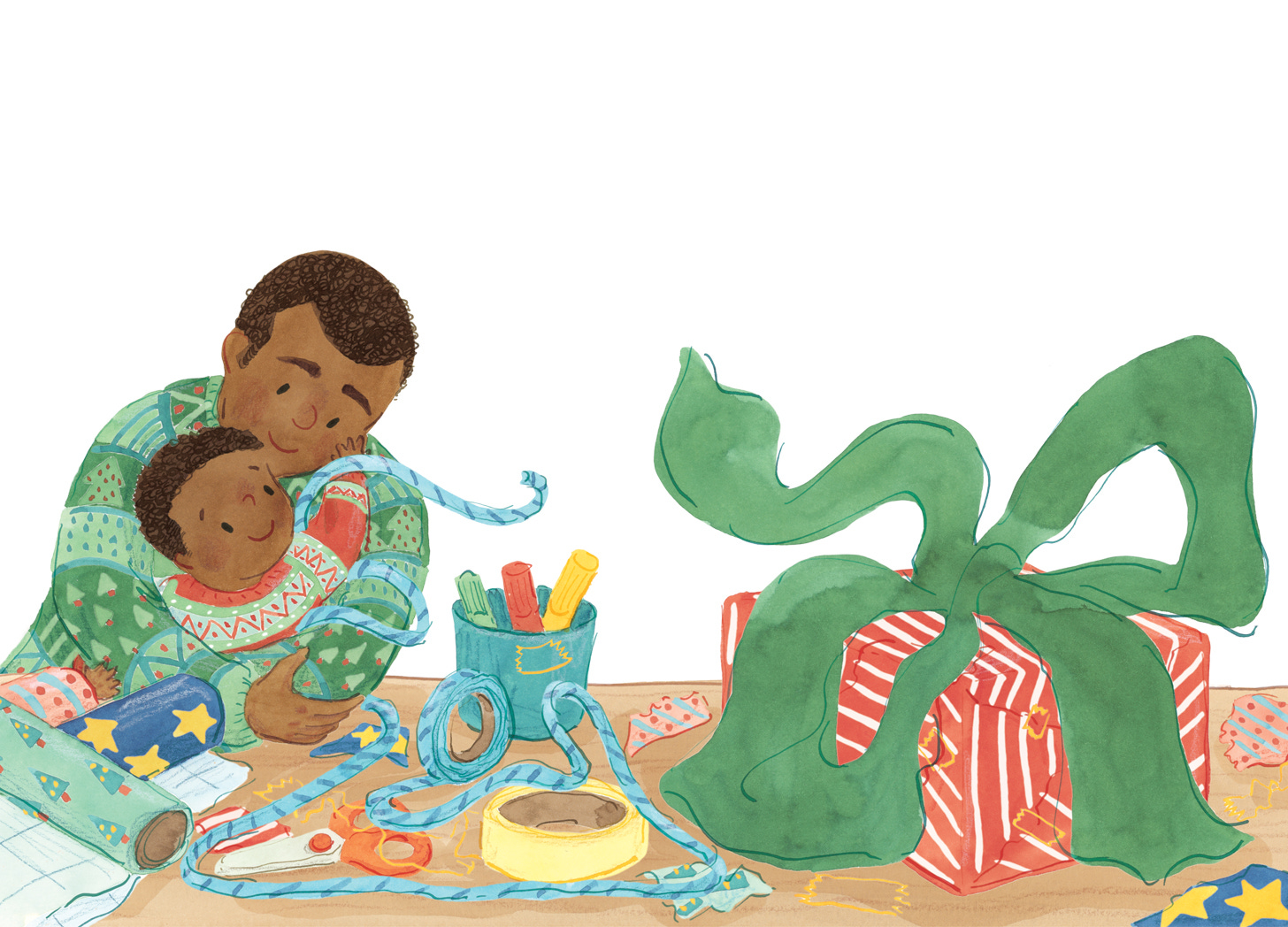
Guessing the missing puzzle piece didn’t give me any trouble, I enjoy the challenge! What did give me trouble was this ribbon:
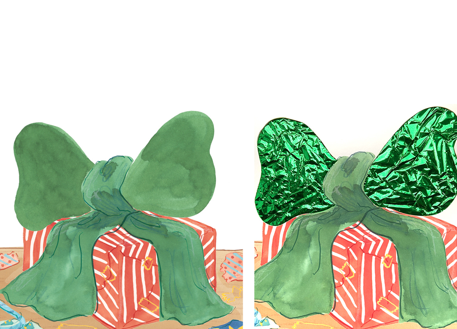
The text had the ribbon do loop-de-loops. The loops would be made of green crinkle paper. This means special paper is sandwiched inside the page and a shape cut out, so the crinkly bit can be touched by tiny hands.
For some reason it never occurred to me (or, to be fair, the designer) that when you cut out around the edge of a loop the middle section falls out too.
Production asked us to make changes so we did - then the middle fell out again!
In the end the ribbon has big puffy shaped bows which have already looped. So it all worked out ok.
crinkle, crinkle.
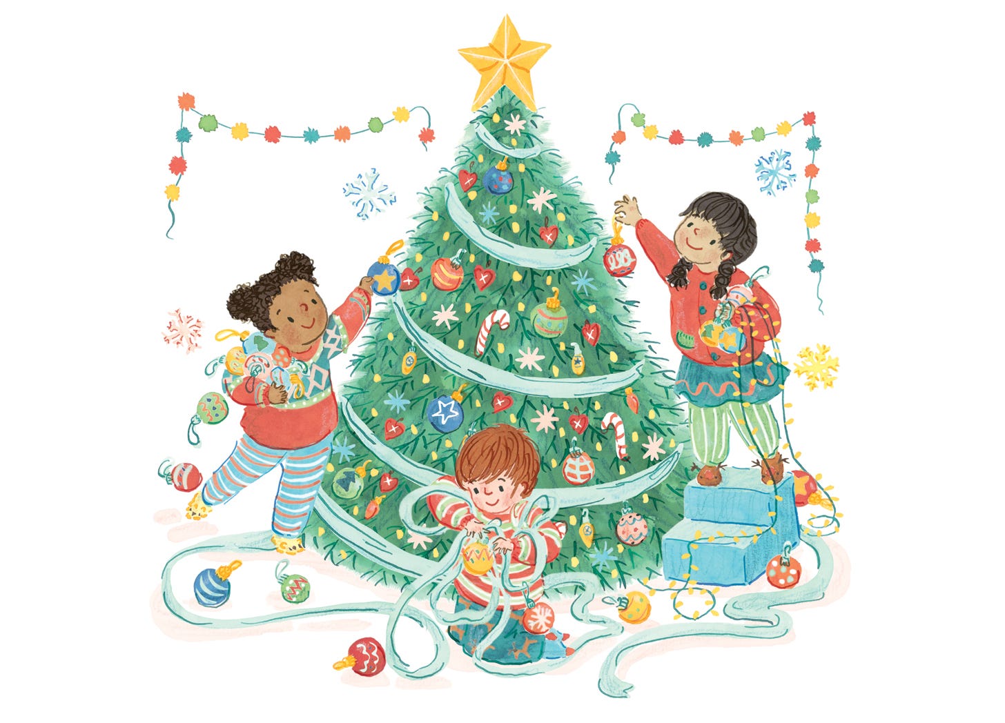
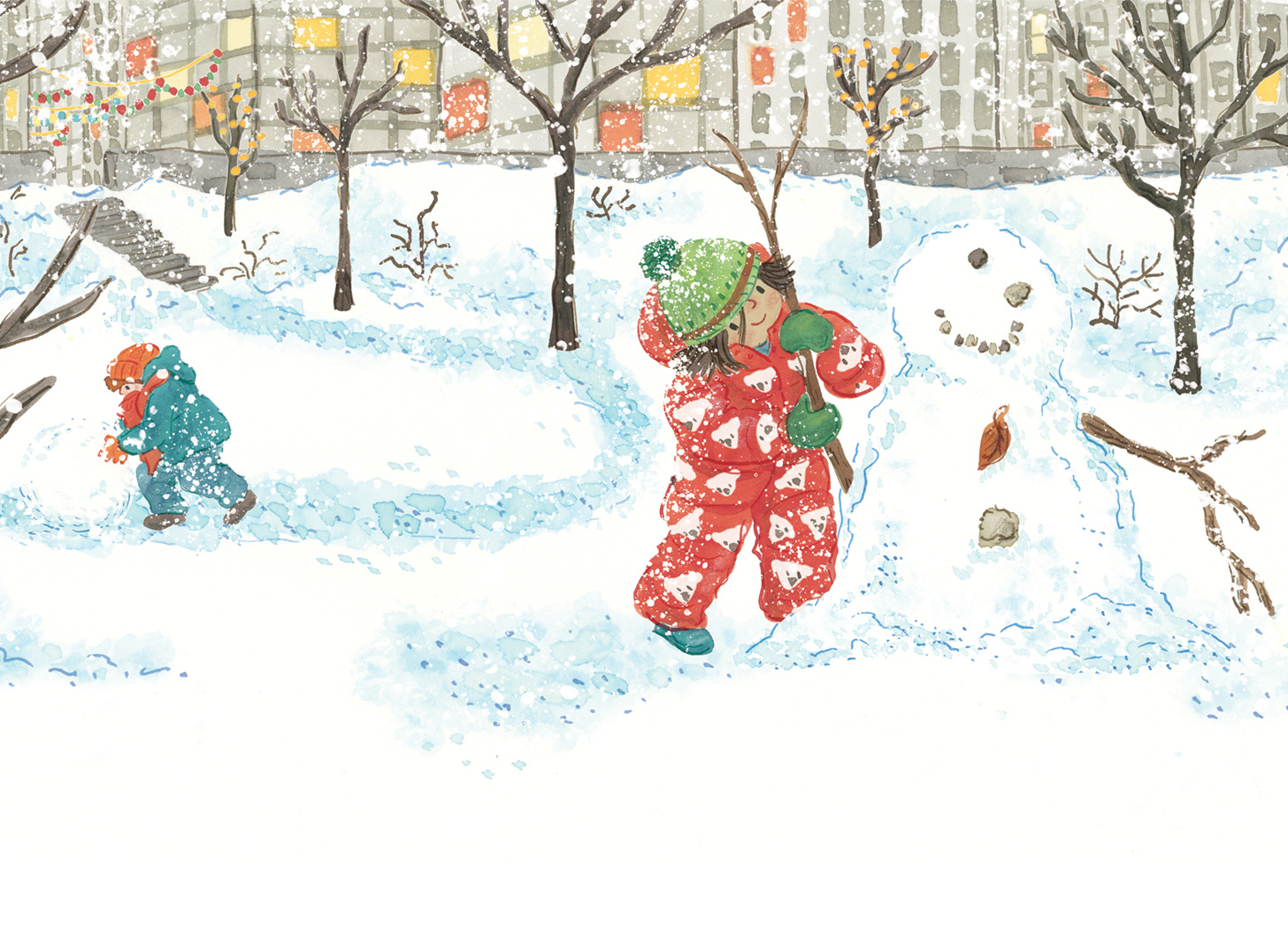
This book is lovely because each page has a different child in a different setting.
So the next puzzle was making a palette large enough for different locations but small enough that isn’t a right visual jumble when you look through the whole book.
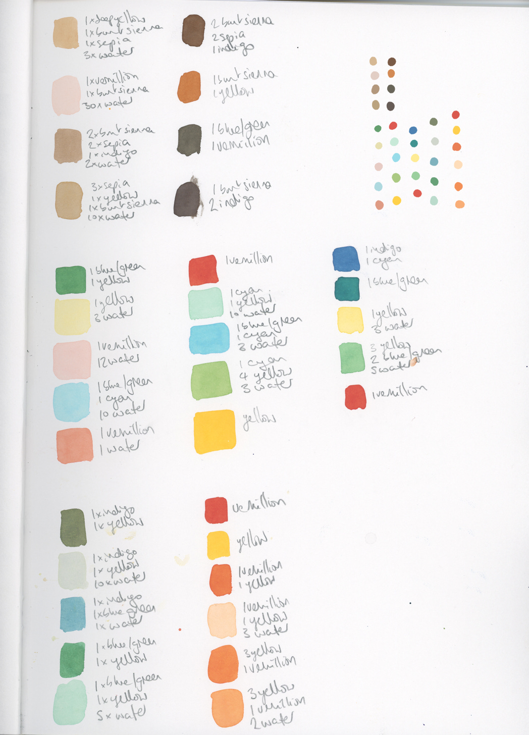
This is a page from my Colour Working Out Sketchbook. I mix what I think I’ll need, using the absolute minimum of colours. Then I paint a little square in my sketchbook and write down the colour recipe it’s made from.
I scan this page and use the eyedropper tool in photoshop to get a digital palette - these colours won’t be 10000% right because scanners and screens all vary but it’s close enough for me at this stage.
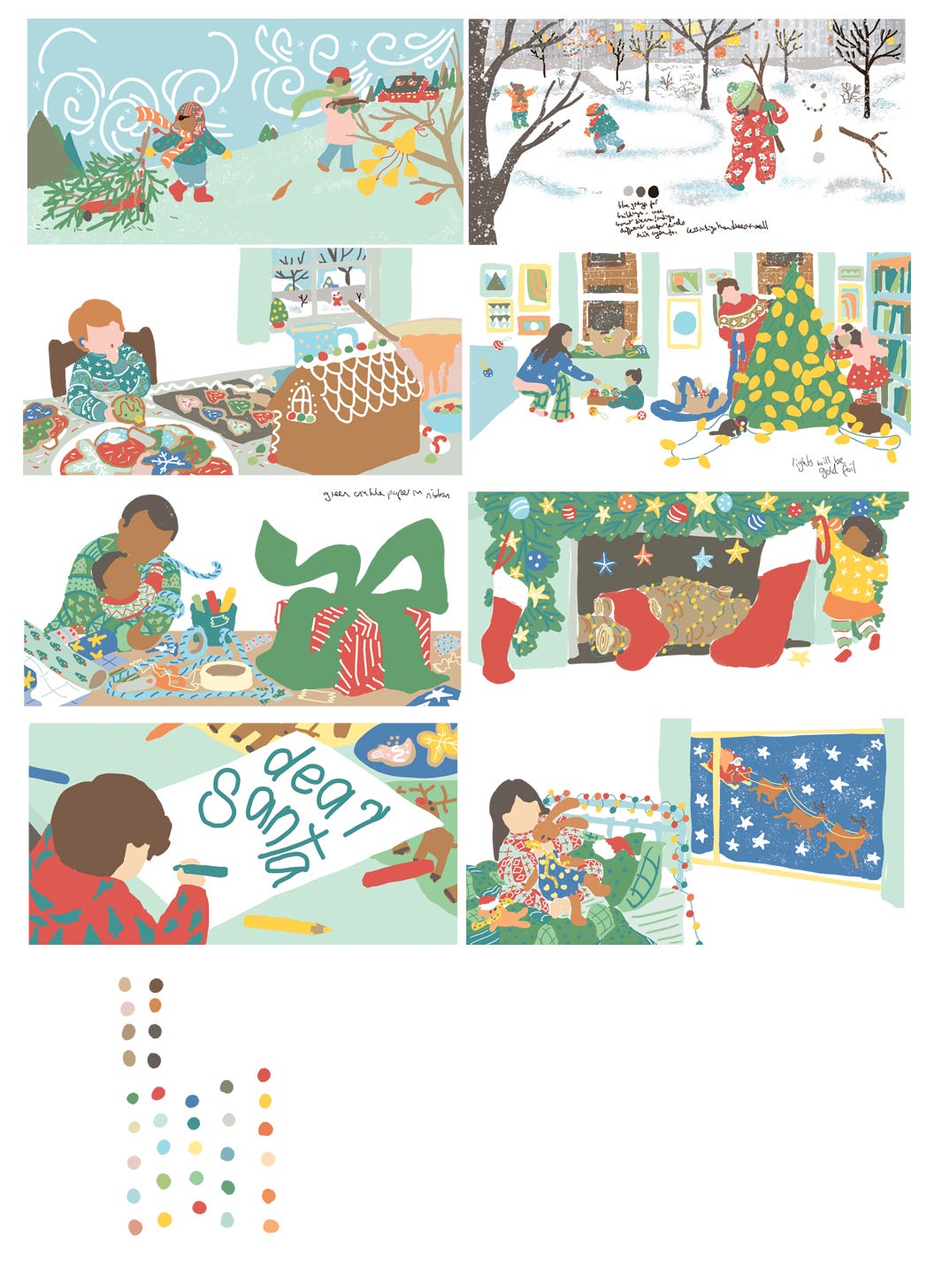
Next I digitally colour all the pages roughly. Then look at them together, so I can make sure there’s a good balance of colour across each spread and they each have their own feeling.
I made that sound like it’s really quick but there’s usually experimenting involved.
There’s some notes written to myself on this page where I needed to mix some darker tone for depth (and to remind myself of some of the textured finishes).
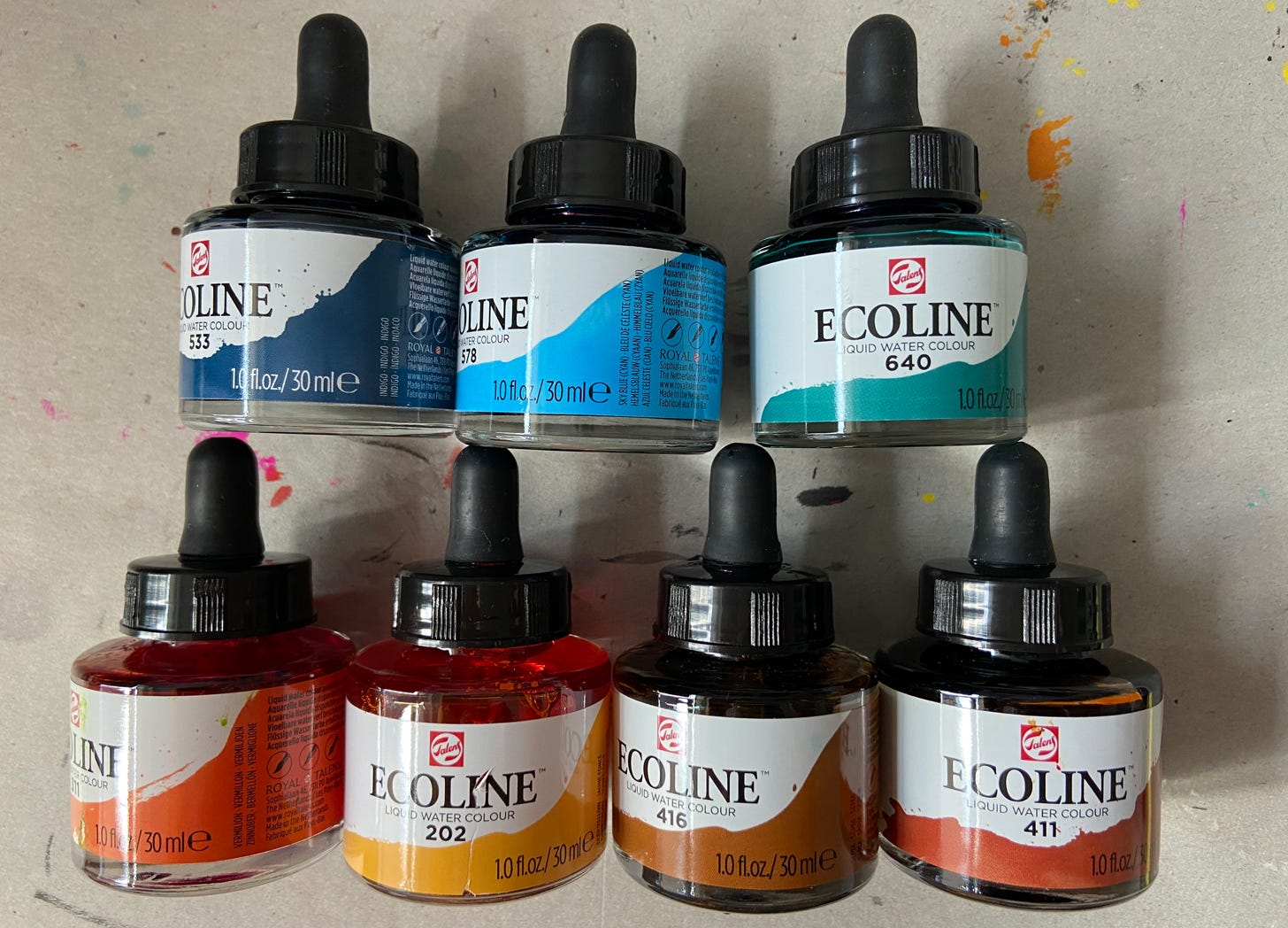
That palette of colour blobs at the bottom left looks like loads of colours but all the backgrounds, skin tones, hair colours, outfits and Christmas decorations are all made with the same selection of 7 different watercolour inks.
And because all the colours come from a small selection, they all work together. Colour is amazing isn’t it?!
After I’ve made a plan digitally, I get my paints back out and paint the artwork on paper, using my digital colour plan as a guide.
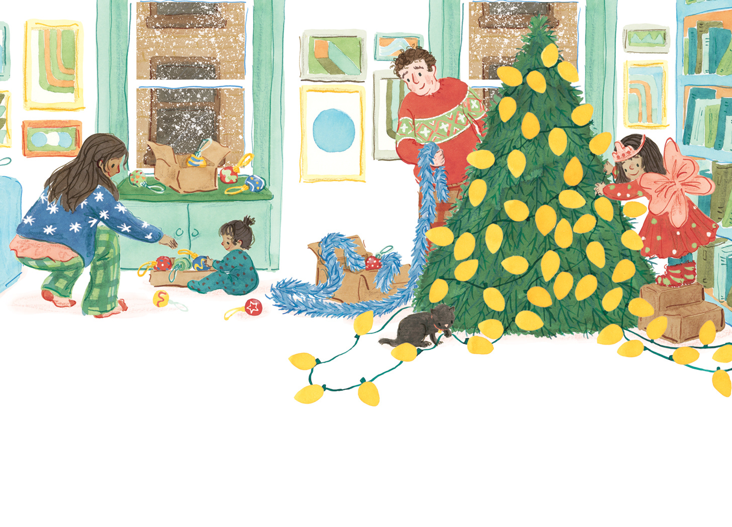
And eventually, after the designer and the publisher and the printer have all worked on it, the finished book looks like this:
If you want to know anything else about illustrating for a novelty book or want to question my colour process, I’d be happy to chat!
All By My Elf by Jeffrey Burton, illustrated by Nanette Regan, designed by Jooahn Kwon, published by Little Simon (Simon & Schuster)
Available in the US at Barnes & Noble, Target, Amazon and probably other places too.
Available in the UK at Blackwells, Amazon and probably other places too.


This book look beautiful!
Thank you explaining how you made a color palette! While I hadn't thought of that consciously, my last book did all take place in the ocean, so the colors did work out well. Is your book only eight spreads because it is for very young children?