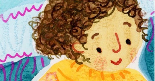
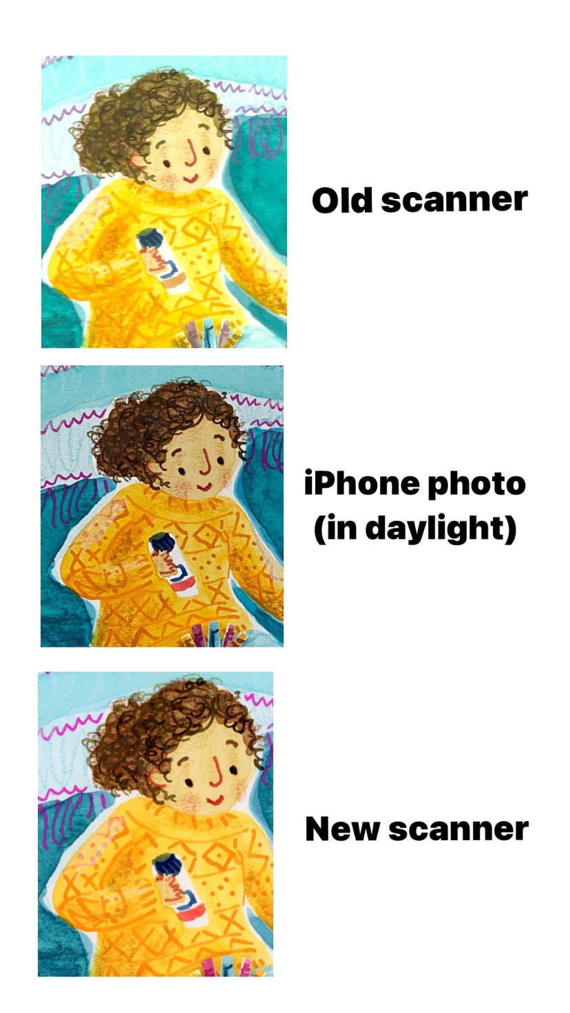
Just look at the difference between these! All the same painting but using a different scanner or camera!
That’s why people who use traditional media (including me) are always asking what scanner do you use? All that time working on your painting and then it’s ruined by your camera or scanner and you can’t show it round the socials and definitely can’t send it to a client!
It took me two years to research and save for a new scanner, I’ve had it for over six months now so I’ve had some good use out of it and can talk confidently about how it’s getting on.
So, what scanner do I use?
⚡️ High speed no-nonsense answer: Epson Perfection V600 (not an ad, btw)
🫖 Friendly, chatty answer below:
There’s lots of internet articles about how scanners can be either CCD or CIS. I don’t know what that means but if you’re tech minded there’s probably lots of fun to be had down those rabbit holes. I was told somewhere that CCD is better for artwork and never googled it again.
Then I went around asking and reading about what other illustrators were using to scan their work. Then I checked my budget.
A lot of folks talked about Epson Perfection scanners. I went for the v600, it seemed a good mid price scanner. I bought the A4 version because it’s cheaper than buying A3 and I don’t have a lot of space.
I also keep other things to A4 for the same reason - I have an A4 lightbox and use A4 paper. So everything is nicely the same size and it all fits together!
The new scanner has made a massive difference to my work flow. The colours look closer to the original so there’s less fiddling about in photoshop to correct them, which means I work faster.
However, the colour on the paper will never never be an exact match for the colour on the screen. And every screen will appear different from every other screen! Arghh!
I use a Wacom and my work looks different on that to how it looks on my desktop monitor.
It probably looks different again on my client’s screen.
Then when I see the work printed in a book it looks different again. Often, but not always it’s darker and flatter.
Printing is a mystical art as far as I’m concerned. I don’t know what clients do to turn my digital files back into physical media. I don’t know what adjustments they make or how they predict the effect of different paper types.
The only thing I can control is how my artwork looks when it leaves me. Changing my scanner has been a big help with that!
So, tell me: what kind of scanner do you use?
All my posts are remaining free and open for the foreseeable future! If you fancy getting me a cuppa tea that would be amazing! Totally up to you, we’ll still be friends!


Hey Nanette! One tip I can give you... I used to work as a designer for years, and for a long time, early on in my career most of the illustrators made analogue work. We (designers) used to get really frustrated when the work printed totally differently, and we were taught to calibrate our screens. Basically there is a setting somewhere for screen calibration (will be different with Macs and PCs I guess) and you can adjust what everything looks like to match a printout (although a screen will never exactly match a printout, because it’s lit up). So, for example, you could calibrate your screen to match one of your books - make it darker, more warm/cool as needed. One more thing to say is: always work in CMYK, even if it is disappointing, colour wise. RBG is basically only for screens and a printout will never match RGB. Finally, some paint colours will never be able to be patched as printed, so you could check how they scan before you use them. If they are too bright (and RGB!) they will probably go greyer when scanned. I should really write about this on my Substack. I love needing out on all of this. Thanks for the scanner tip. I really want to get an A3 one, as I spend hours scanning my work into separate pieces. X
You can calibrate the monitor of your computer so the colours will perfectly match up. The printers calibrate their monitors too, so everything works together nicely. I use a Spyder brand calibrator